Trading With Better Risk Management Leads To Smoother Returns
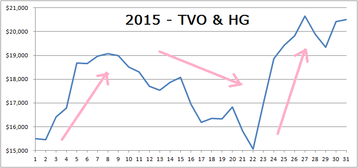
Extensive data analysis is at the core of developing any successful quantitative trading system. Sometimes, though, a simple picture alone is worth a thousand words. The TVO System with the newly added Heat Gauge came out ahead in 2015 achieving a 28% return at the end of the year. As far as the equity curve goes, however, the ride to a high return was not exactly a straight line. The graph below represents the two systems used at the time, TVO (Total Volume Oscillator) and HG (Heat Gauge).
What I started to see was how lack of diversity can affect a system. HG was designed to enhance TVO, but too much focus on one methodology over mostly one timeframe led to far too much drawdown. Although the account made a complete recovery, it got me thinking that perhaps HG was sometimes just too much of a good thing.
During periods of high volatility, HG generated a lot of signals too close together.
The signals were so close that if you ended up taking them all, you would have to average into your initial position to the point where too much risk continuously gets put on the table. Added risk can lead to greater gains, but the opposite is also true, and too much too soon can magnify the negative moves. Even with a long term positive result, there’s quite an uncomfortable ride that comes with it.
A new perspective was needed to put things in check and smooth out the curve. Working with volume and ignoring price data was the out-of-box thinking that originally led to TVO and then HG. Being tied only to volume, though, in many ways formed its own restrictive box. I began to examine other types of data with the same approach I took when coming up with TVO… the idea is to learn all you can about what everyone else is doing, then throw all that out the window and come up with your own method.
After combing through what was available, I honed in on the daily numbers of rising and falling individual stocks. Advancing and declining issues data, as it’s known, is widely studied and there are already many indicators based on it, but after applying variations of the original TVO algorithm, new and interesting patterns started to emerge.
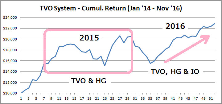
In 2016, IO was added to the TVO System.
The time frame of the strategy is medium term (somewhere between TVO and HG), and gives us almost as many trades as HG. Because of this we were able to size down the frequency of HG signals. This diversity of time frames acted to smooth out the curve. The three systems work together in a checks and balances sort of way. If TVO and HG are the Congress and the Executive Branch, then IO is like the Supreme Court, keeping the other two from getting too much out of hand. IO along with HG and TVO, produced a 34% return in 2016, and did it with close to a straight line.
One could argue that the prior year of 2015 was simply a turbulent one for the market and difficult for any system to navigate through. On the other hand, 2016, with the Fed’s ongoing rate hike saga as well as brexit, certainly was no picnic as far as turbulence. Despite all that, the TVO System with IO and HG came out ahead and continues to out perform the market (For the complete list of trades since 2016, check out our Trade History). With IO added to the mix, we now have a diverse and robust system to slowly and steadily build capital in the long run. -MD
But wait, there’s more… next up is Next Day Move.
Want to read more? Join our list. It's free.
For the full rundown on today's active signals and options trades, please log in. Not a Member? Join us today.
To view past positions check out our Trade History.
To find out what the indicators mean, visit our Market Volume Volume Barometer.
To learn more about market volume and how we trade, find us on Twitter (@TradingLicks) and StockTwits!


